2027 Paint Trends Bring Rich Greens, Warm Neutrals and More Colorful Details
From chocolate walls to painted doors, 2027’s paint ideas pair earthy colors with personal details. Sample shades at home before committing.

The most noticeable shift in 2027 paint ideas is how much room there is for personality. Rich greens and browns sit alongside softer shades, while painted ceilings, doors and built-ins give color a place beyond the walls. A small project can make a room feel considered; a full-room color choice can change its entire mood.

The palette spans classic and unexpected choices: Benjamin Moore’s Webster Green HC-130 and Sherwin-Williams’ Celery SW 6421 are both named as 2027 colors of the year by their respective brands. Chocolate brown, buttery yellow, dusty pink, warm cream, terracotta, smoky blue, burgundy and olive also feature. These are ideas to adapt to a home’s light, materials and furnishings, rather than a checklist to follow all at once.
Paint can also do more than cover a wall. Limewash adds subtle texture; color drenching carries one shade across walls and trim; and a painted door or pantry can be a contained way to experiment. The right scale depends on how much change you want and how easily you’d like to live with it.
Love home decor trends? Don’t miss this post:
The Top Home Decor Trends for 2027 That Are Seriously So Good
Colors with depth and warmth
Classic green and soft celery
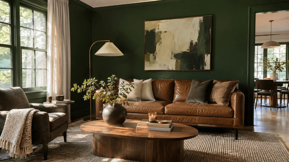
Green remains a flexible starting point, but the emphasis has moved toward richer, more traditional shades rather than pale sage alone. Webster Green HC-130, Benjamin Moore’s 2027 Color of the Year, has a classic, slightly moody character. It could suit a home office with a substantial wooden desk and vintage artwork, or a dining room furnished with dark wood. Its depth gives a room presence while keeping the palette grounded.
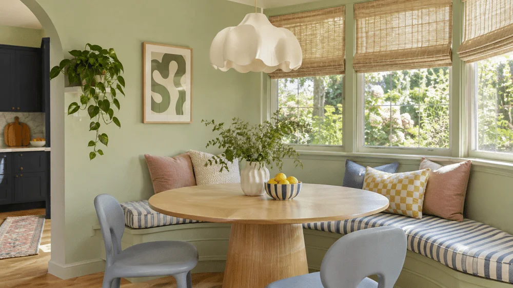
For a lighter take, Sherwin-Williams selected Celery SW 6421 as its 2027 Color of the Year. This green leans yellow and feels fresh and cheerful. It’s an option for a breakfast nook with a wooden table and cream curtains, or for kitchen cabinets. Compared with sage, celery brings a brighter note; it may appeal to someone ready for a change who still wants a soft, nature-inspired color.
Chocolate brown and buttery yellow
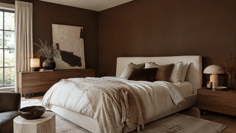
Deep chocolate brown makes a strong case for treating brown as a deliberate color, rather than a background neutral. Sherwin-Williams Bitter Chocolate SW 6013 is one example. The shade is described as rich and cozy, with a dramatic quality that can work well in a bedroom alongside cream bedding, a vintage dresser and warm lighting. In a room with limited natural light, its depth may feel more enveloping, so testing it in the space matters.
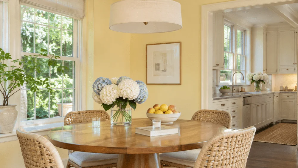
Buttery yellow offers warmth with a gentler effect. Benjamin Moore Shakespeare Tan 228 has a soft golden tone that could bring warmth to a dining room with a dark wooden table and vintage chairs, or to a sunny kitchen with cream cabinets and wood accents. The appeal is its comfortable glow rather than a bright, high-energy yellow.
Dusty pink, warm cream and terracotta
Muted pink can read more like a quiet neutral than a sugary accent. Benjamin Moore Wild Aster 1240 is a dusty pink with a lavender-like undertone. Paired with antique wood furniture, cream bedding and vintage artwork, it could give a bedroom a romantic feel without making the palette overly sweet. Its appearance will depend on the light in the room, so a sample is especially useful before painting a large area.
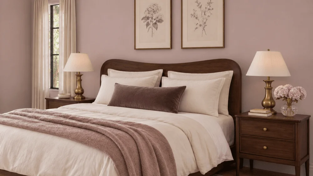
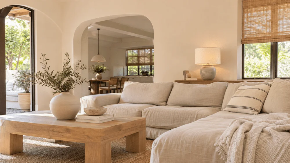
Warm cream offers a softer alternative to bright white. Benjamin Moore White Down OC-131 and Sherwin-Williams White Duck SW 7010 are two shades to consider. With natural wood, warm furnishings and textured fabrics, a creamy white can bring the elements together without the stark feel of a cooler white. A small change in undertone can shift the atmosphere of an entire room.
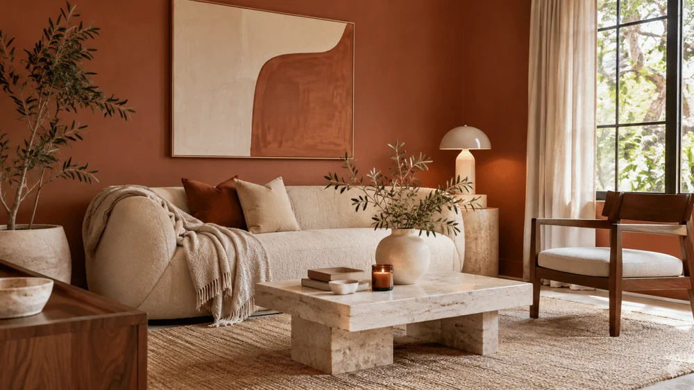
Terracotta and burnt clay continue in a more muted, earthy direction. Benjamin Moore Antique Copper 1169 is one option. Cream furniture, vintage rugs and natural wood can balance its warmth, while the color itself gives a room more character than a neutral scheme. It may suit homes with collected, vintage-inspired furnishings, particularly where the goal is warmth without losing visual interest.
Smoky blue, burgundy and olive
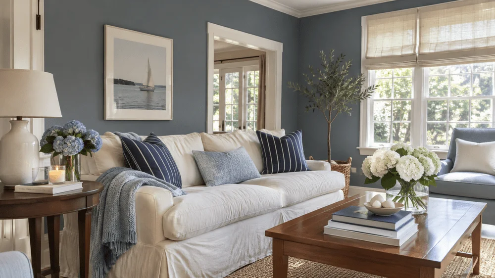
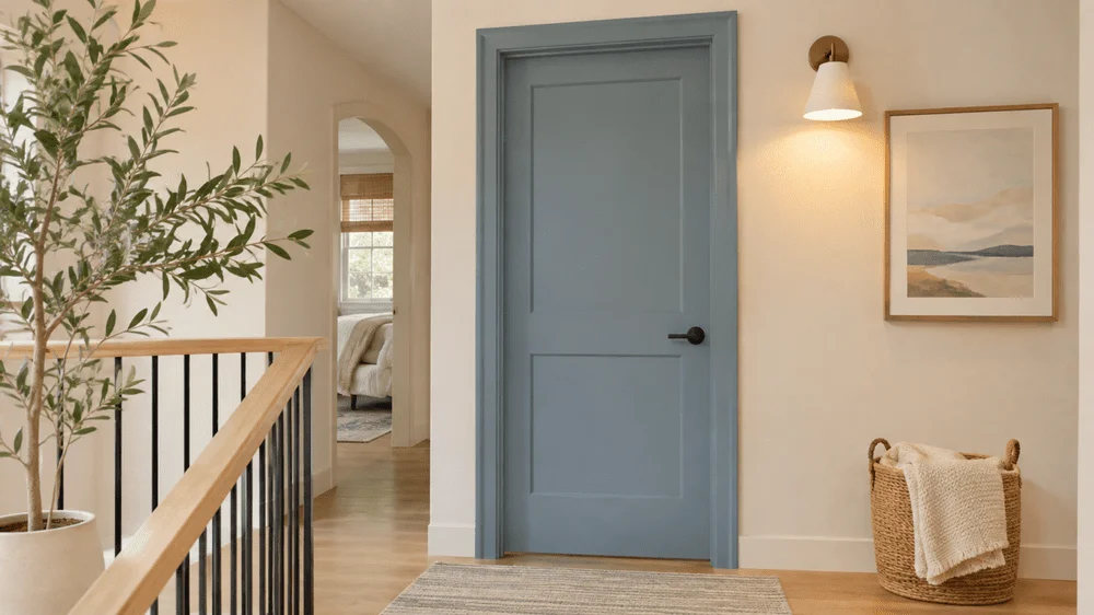
Smoky blue shifts blue away from bright coastal shades and toward something quieter and moodier. Valspar’s 2027 Color of the Year, Cottage Door, is an example. In a bedroom, it could pair with cream bedding, dark wood furniture and brass lamps. Muted blue supplies color without making the whole room feel busy, and furnishings can steer it toward either a classic or a more relaxed look.
Deep burgundy brings a bolder, wine-colored note. Benjamin Moore Townsend Harbor Brown HC-64 has a rich reddish-brown quality within this family. It could anchor a dining room with dark wood and warm lighting, or turn a small powder room into a more dramatic space. This shade makes a strong impression, so it may be easier to try in a compact room or on a single feature before using it throughout a larger area.
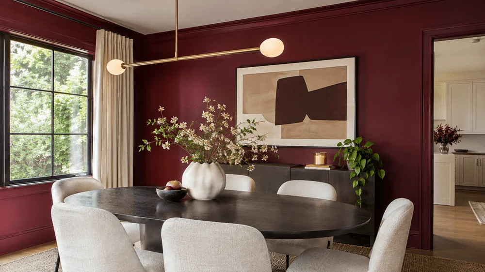
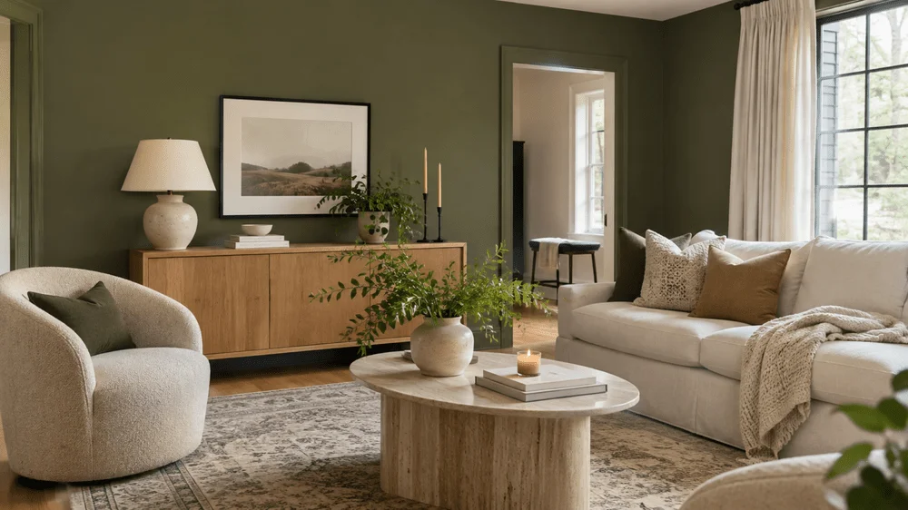
Olive is a gentler entry point for anyone drawn to green but not ready for a very dark shade. Behr’s 2027 Color of the Year, Grounded, is a mossy olive. Cream furnishings, vintage rugs and warm wood all complement its earthy character. Olive has enough definition to give a room personality while sitting comfortably among a range of natural materials.
Ways to bring color and texture into a room
Limewash and hand-painted details
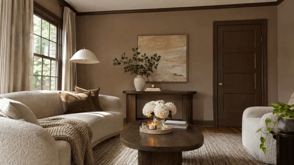
Limewash gives walls soft variations that resemble stone, making it an option for people who like neutral rooms but want more surface character than flat paint provides. Warm beige, taupe and creamy off-white are natural fits for this effect. Picture limewash with linen bedding and vintage wood furniture for a bedroom with a quieter, layered feel.
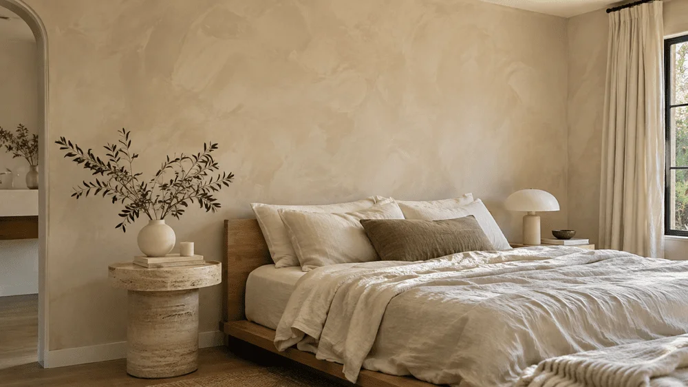
There is a practical trade-off: limewash takes more work than standard painting, and traditional limewash calls for the right surface preparation. That added effort may make sense when the wall texture is central to the room, but it’s worth understanding the preparation before starting.
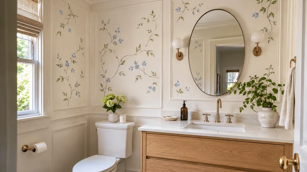
Hand-painted botanical details offer a smaller-scale way to make a space feel individual. The idea is a few flowers inside wall molding, a vine around a doorway or a detail tucked into a corner, rather than a mural across the whole room. Bedrooms and powder rooms are suggested spots. For someone comfortable with a brush, this could also become a manageable DIY project.
Color drenching, ceilings and trim
Full-room color drenching means painting the walls, trim, doors and ceiling in the same shade. Repeating one color can make the room feel deliberate and may be an appealing way to use a deeper green or chocolate brown. A home office in rich green or a bedroom in brown would create a strong, unified effect. It also removes the need to choose a contrasting trim color.
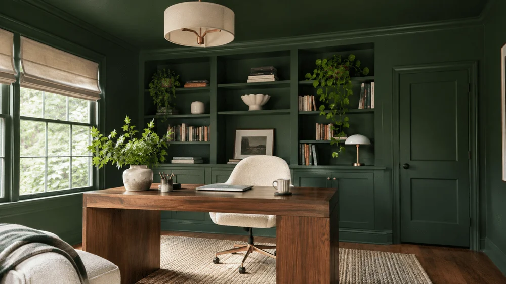
If one shade across every surface feels like too much, tonal drenching uses several shades from the same family. Medium taupe walls might sit alongside deeper brown trim and a lighter cream ceiling; soft green walls could be paired with darker green doors. This approach keeps the palette cohesive while adding variation, and it can give a neutral room more depth without introducing several unrelated colors.
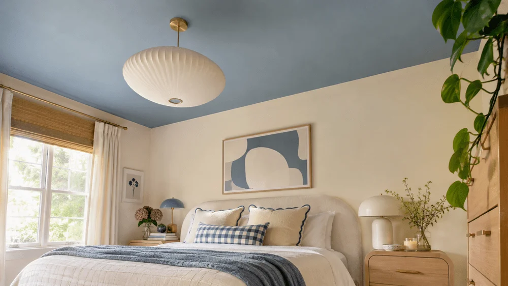
A painted ceiling is another way to add color without filling the walls with it. A soft blue ceiling with cream walls, or muted green above a dining room, offers an unexpected point of interest. Rooms with ceiling molding may provide a natural frame for the color. The effect can stay subtle, or the ceiling can tie into a broader tonal palette.
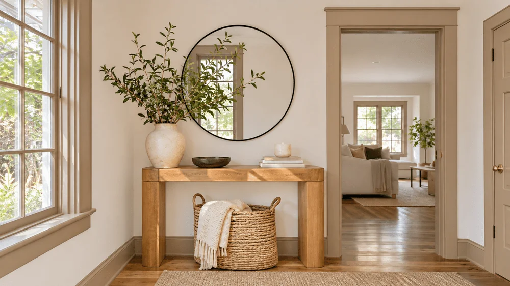
Trim doesn’t have to be white. Deep olive baseboards and door frames against creamy walls, or darker blue molding against pale blue walls, can bring color to architectural details without covering every wall. This is particularly suited to older homes with features worth drawing attention to, though even painting only the door frames can change a room’s feel.
High-gloss paint adds shine to doors, built-ins and decorative molding. A glossy burgundy door or chocolate brown built-ins can make a saturated color feel more finished. Using gloss selectively keeps it a statement detail. The finish shows surface imperfections, so careful preparation matters before applying it.
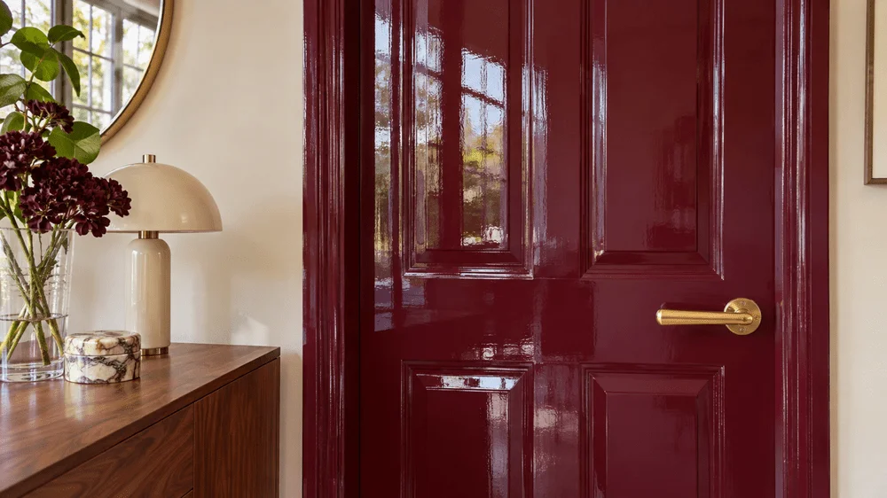
Painting an interior door is a smaller commitment than recoloring an entire room. Olive green, dusty blue, burgundy and chocolate brown are all possibilities, and painting the door and its surrounding trim the same shade can make the feature feel intentional. It’s a contained project for anyone who wants to try a trend without taking on a full makeover.
Cabinet color ideas for kitchens and pantries
Deep green, dusty blue and chocolate brown
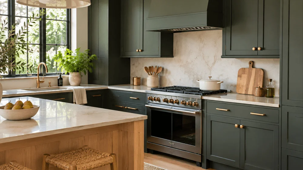
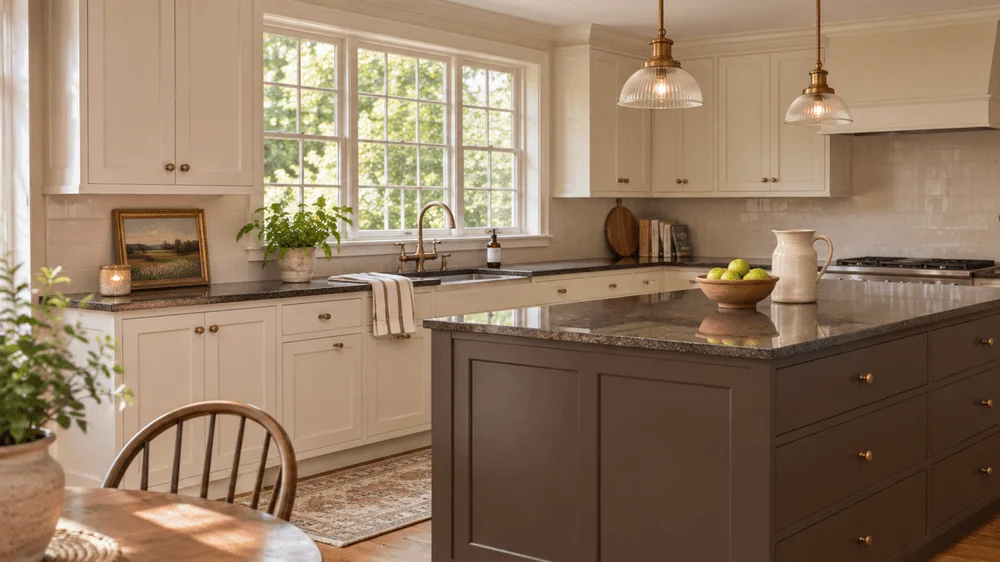
Green kitchen cabinets remain appealing, with attention turning toward deeper shades. Sherwin-Williams Roycroft Bronze Green SW 2846 is one example. Creamy stone counters, brass hardware and warm wood accents would balance its depth. The shade may work with both traditional and modern kitchens, giving it a little more staying power than a choice made only for a passing look.
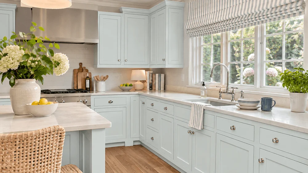
Dusty blue offers color for a kitchen without the weight of a very dark cabinet. Benjamin Moore Nelson Blue CW-635 appears in its 2027 color palette. It could pair with cream walls, warm wood floors and simple brass hardware, particularly in a kitchen with vintage touches. For someone tired of white cabinets but hesitant about a deep shade, muted blue is a useful middle ground.
Chocolate brown cabinets bring a warmer alternative to black or very pale cabinetry. The look described here is a deep, rich brown that can resemble dark wood, rather than orange-toned cabinets. Light stone counters, cream walls and warm brass hardware would help balance the dark finish. It may suit a kitchen meant to feel cozy and grounded more than bright and spare.
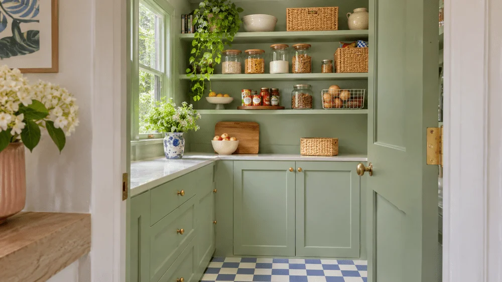
Make the pantry a smaller experiment
A pantry with its own cabinets or shelves offers room to test a bolder color without repainting the whole kitchen. Burgundy cabinets or celery green shelving with brass hardware could make opening the pantry feel like discovering a distinct little space. In a walk-in pantry, painting both the walls and shelving the same shade could create a more enveloping look. Its smaller footprint makes it a natural place to take a creative chance.
Statement projects beyond the walls
Staircases and built-in bookshelves
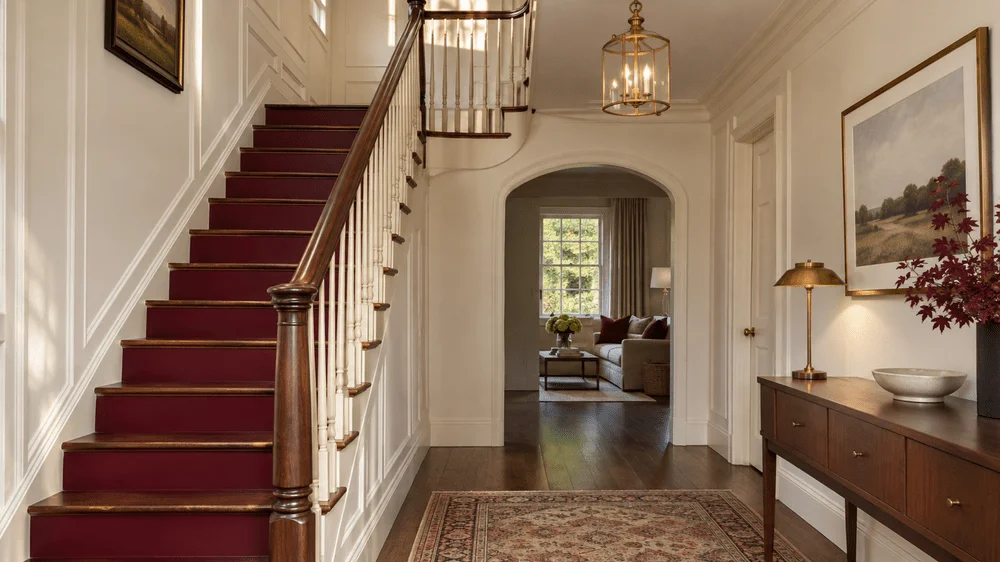
A staircase can become a feature with selective color. Deep olive risers alongside natural wood treads bring contrast while preserving the wood’s warmth. Painting a banister burgundy leaves the other surfaces quiet, while a dark glossy staircase can stand out in a light entryway. Stair treads take substantial wear, so the paint needs to be appropriate for that surface.
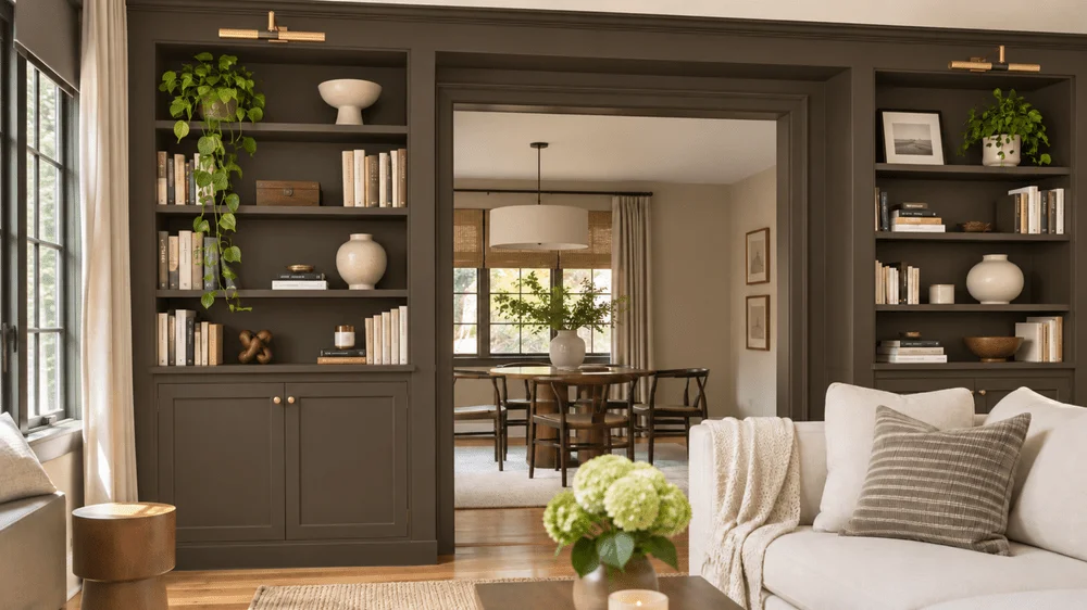
Built-in bookshelves are another strong candidate for a rich shade. Deep green shelves filled with vintage books, framed art and collected objects can make a room feel more tailored without changing its furniture. Webster Green HC-130 is one suggested option. Keep the surrounding walls neutral for contrast, or carry the color across the room for a drenching effect.
Wainscoting for a two-tone room
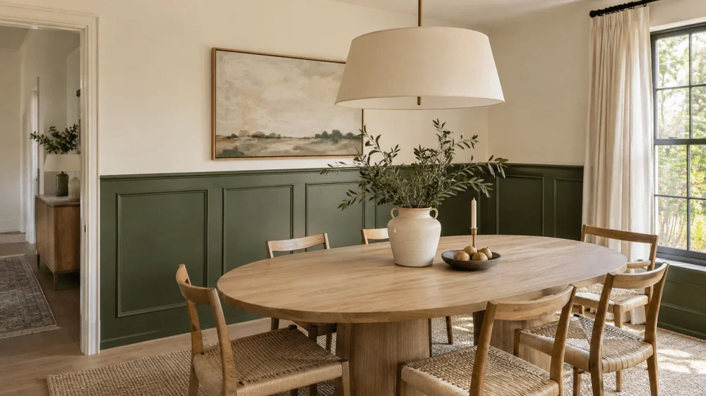
Two-tone walls feel more intentional when molding or wainscoting defines the boundary. Deep olive paneling on the lower half of a dining room, with cream above, brings in a darker shade without letting it dominate the whole space. In a bedroom, dusty blue wainscoting could sit below a lighter blue. The architectural detail gives the color change a clear edge and can make a simple room feel more finished.
The common thread across these ideas is a more considered use of color: choose a shade that works with the room’s light and existing materials, then decide how much surface it needs. Before committing, sample the paint in the actual space. A color that looks right in an image can read differently at home, and seeing it on your own walls is the best way to judge whether you’ll enjoy living with it.
Love keeping up with the trends?
Check out all my trend reports for 2027!